Would you like to learn how to style your shelves like a pro and make them look like those on the cover of a magazine?
I knew that when I bought these beautiful shelves I would have many ideas on how to style them with Christmas being no exception!
I am not gonna lie, it took me almost a whole afternoon to decide how I wanted these bad boys to look.
They are, after all, one of the first things you see when you walk in the front door.
They have to look just right if they are setting the stage for the rest of the room!
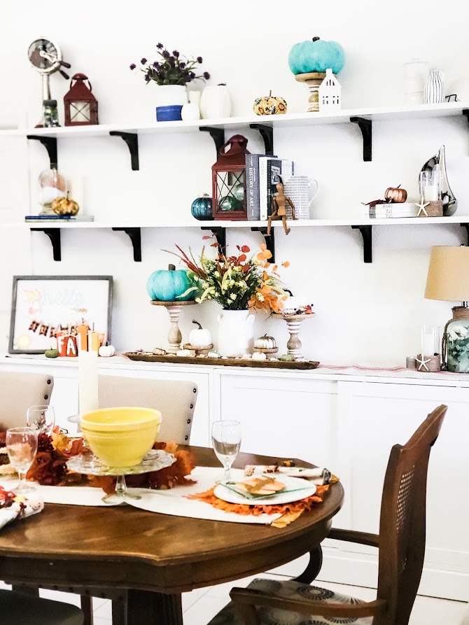
First, start by removing everything from the shelves.
Then give the shelves and the décor a good cleaning.
I packed the Fall décor items carefully away in storage bins I bought just for these items.
Next, group items into odd numbers of varying heights, basically 3’s and 5’s.
Styling little vignettes in odd numbers is more pleasing to the eye and feels less “chaotic.”
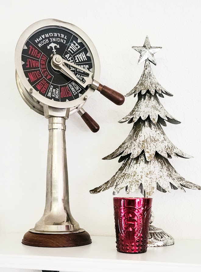
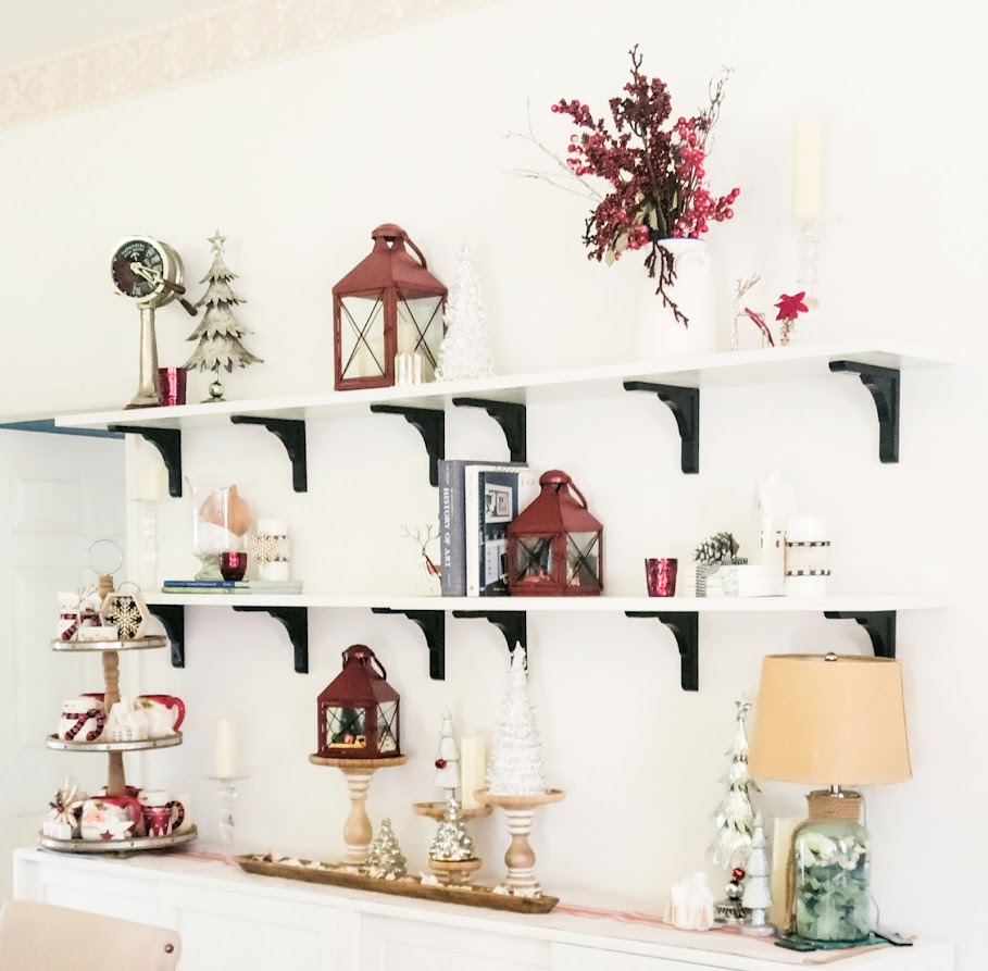
Start placing items on the shelves. This is the most tedious part.
Not only does each grouping have to blend, but it also needs to work with the whole shelf plus the other two shelves.
Now you know why it took me all afternoon to complete it!
You see, my three red lanterns would not look right if all placed on the same ends of the shelves.
By staggering them your eye moves around and does not get hung up on the fact that they can only see three red lanterns.
Also, notice that the color red is used in every vignette. By doing this, you will have a better chance of each grouping tying in with the whole picture (i.e., all three shelves).
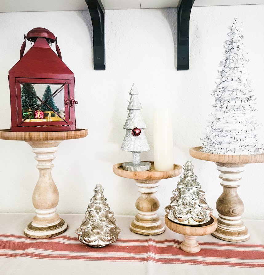
Next, you need to be mindful of the height of each item. Varying this with each grouping also helps your eyes move smoothly along.
I bought candlesticks and bamboo plates in varying heights and sizes to make these beautiful risers.
All you need is a dab of E6000 and voila!…fancy risers!
The way your eyes move along a surface can tell your mind that something is either beautiful or that things don’t feel right.
Kind of the difference between Oooooo! And Ewwww!
Also, if you notice, I leave quite a bit of space between my groupings.
This gives the illusion of order and has a much cleaner look than shelves that have too many items competing for attention.
I guess you can say that less is more when styling shelves. Ha!
I also use this formula when styling tabletops as well. This sofa table is in my entryway and is THE first thing you see when you step into my home.
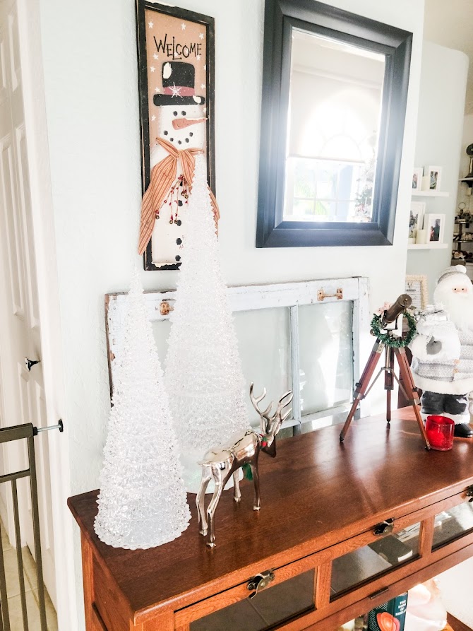
See? You really can learn how to style your shelves like a pro and to make them look like those on the cover of a magazine!
Do you love this and was it helpful? Please send me a comment and let me know your thoughts. I would love to hear from you!


