Today I would like to have a chat about color. It’s the one thing that evokes strong emotions of love, hate, happiness, sadness, anger I could go on and on. It can make a painter frustrated or a designer want to toss in the towel. To create something beautiful, you need to understand color and how it behaves in the eye of the beholder.
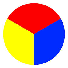
Primary Colors
There are three basic (primary) colors that drive every other color in the world! Pretty amazing when you think of it. The value (shade) of the primary color you choose will drive the rest of the pallet to that value.
For example, if you choose a warmer shade of red, yellow and blue, your pallet will mix warmer shades.
See in this example how two different sets of primarycolors make two different color wheels.
One is noticeably darker while the other is more pastel or muted.
Color value can also be described as “temperature.” A cool red is closer to the blue side of the chart and a warm red is closer to the yellow side of the chart.
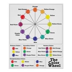
Secondary Colors
Next, after the primary colors, comes the secondary colors. These are colors born out of the primary colors you chose.
Orange, violet and green come from equal parts of these primary colors or a 1:1 ratio.
Tertiary Colors
Lastly, (not really) I want to chat about “tertiary” colors or colors that come from mixing a primary and a secondary color together. This is where it gets fun! 😊 Red and yellow (primary) colors make an orange (secondary) color. Red and orange will then make red-orange, or a tertiary color. Whew! That’s a bunch! I need more coffee! Ha!
Complementary Colors
Look closely at where the colors are placed on the chart. Follow the line from one color directly across the chart to the color opposite. This is called a “complementary” color of the first color chosen.
For example, if you chose green, the complementary color is red. Merry Christmas! Even though you might not choose to decorate all year long with this seasonal favorite, they are considered complementary the same as with blue and orange and yellow with purple.
When choosing complementary colors, it is usually best to pick one color as your main color (80%) and the other as an accent (20%).
Main Color with Accent Color
This photo is a great example of choosing blue as your main color and orange as the accent. (photo from homestoriesatoz.com)
Analogous Colors
Four colors on our color wheel that are next to each other in a row are called Analogous colors. These combinations work great when done properly as these two examples from Pinterest shows us.
Monochromatic
Lastly, (I really mean it this time) is monochromatic. This is when a color is mixed with black or white to make it lighter or darker. This is kind of tricky because all of your decor needs to start out with the same color value.
See this cute dining area in this picture from Pinterest? It all started with the color magenta. From there, various décor items have been added either lighter or darker (adding black or white to the original color).
Taking color samples with you on shopping trips is an absolute MUST when trying to achieve a monochromatic room.
Thank you so much for sticking with me through this chat.
Getting the colors right will help you design a space you will love!
I also am excited to read your ideas on furnishing a beautiful home for the life you desire. I look forward to this journey with you! It has been a long time coming!
–– Danielle
Hi, I’m Danielle!
I am the designer, writer and diy’er behind this blog. I enjoy decorating my home for practically nothing by doing most of the work myself, finding new and imaginative ways to make it beautiful and by watching for killer sales. I find humor almost anywhere and can laugh at myself through it all. I have learned that most projects don’t go exactly as intended, but can be more beautiful than the original plan.
Re-Fabbed Boutique – Beautiful, quality clothing for women of all shapes and sizes!!
We use cookies to ensure that we give you the best experience on our website. If you continue to use this site we will assume that you are happy with it.OkNoPrivacy policy
You can revoke your consent any time using the Revoke consent button.Revoke consent