How was your week? Did you create something wonderful? I hope it was amazing!
In Design 101, Part 1, I told you about the importance of finding your decorating style and personality. Did you pull pictures of rooms that made your heart happy? What was it about those images that you liked? How did they make you feel? Was it the architecture of the room or maybe the color pallet that stopped you in your tracks? How about your wardrobe? Did it give you some indication of your current style?
Don’t fret, my sweet friend. It can all get a little confusing when you are trying to nail down a decorating style. I truly know how frustrating it can all be. I am going to give you some pointers and maybe a little inspiration.
So just relax, grab a coffee or a coke, and just enjoy how unique and special you are.
When you are decorating on a budget you need to focus on one room at a time. It is hard to complete your entire home at once, so your best option is to decorate each room separately. They can each have a slightly different style, but you need a common thread when transitioning from one room to the next.
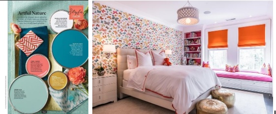
These examples of paint colors from Better Homes & Gardens (bhg.com) show how you can paint each room a different color, but still maintain a cohesiveness throughout your home.
First, prioritize which room you would like to focus on and begin with that. How does this room need to function? Is it for dining, entertaining or maybe sleeping? Second, what is it about the room that you would like to change the most?
Let’s take a look at the architecture of your space. Would farm-style window trim or crown molding make the space more inviting? Installing architectural elements to a room is easier and cheaper than you think.
I was able to install window trim, with the help of a friend, on two of my larger windows for about $40 each!
What an impact it made and with only a small portion of my budget!
Karl enjoys the sun that comes through these windows in the morning! Ha!
Another way you can add architectural style is by installing a coffered ceiling. I really recommend that you hire a professional for this job. It’s a little more costly, but the results really add drama and an “upscale” quality to your home!
A less expensive way to add drama is to make a feature wall. These large Chesterfield white architectural grade PVC decorative wall panels are by Ekena Millwork and can be purchased at the home depot
Next, take a look at the color pallet you wish to use. Are these colors prominent in other areas of your home? Are they your favorite colors or are you trying to “break out of the norm?” There are many ways to use color in your home.
The trend being white walls and ceilings with color brought in from textiles (pillows, upholstery and window treatments), hard surfaces, art or painting a focus wall. If this is more to your liking then great! Just be careful not to overpower your space with too many colors or too much of one color. Trust me, it is easy to do.
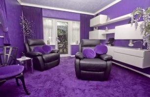
For example, you have painted the walls the perfect shade of purple. It looks amazing so you add pillows, a couple of table lamps and two accent chairs all the same shade of purple. When you have too much of one color, especially if it is the same shade, you will feel like you are drowning in that color.
Instead, add elements slowly. Making purchases a little at a time will help you to find that “just right” mix of color as well as help your budget by not buying things you are not particularly fond of, but were in the color you were looking for.
It is also a good idea to pick more than one color for your new room. Find colors that complement one another such as turquoise and coral for a beach inspired space or pink and orange for a teenage girl. Having more than one color is more pleasing to the brain and will give your eyes more “landing areas” throughout the room.
If you are planning to paint your walls a color other than white, use paint samples and test the color in various places of your room to see how the color reacts to daylight and lamp light before purchasing a gallon of the paint color. Be sure the color you choose will still be perfect with natural light coming into the room and with lamps or the bulbs you choose to light the room.
You may completely disagree with the color scheme you have chosen once you have seen it in different lighting. You don’t want to have to spend more money to change what you have decided upon.
In Design 101, Part 3, I will be talking about the importance of shopping your house and how to decorate and design spaces of your home if you are renting or living in a space that you don’t plan to be in for a long time. Until then, have an amazing and creative week!
– Danielle
Hi, I’m Danielle!
I am the designer, writer and diy’er behind this blog. I enjoy decorating my home for practically nothing by doing most of the work myself, finding new and imaginative ways to make it beautiful and by watching for killer sales. I find humor almost anywhere and can laugh at myself through it all. I have learned that most projects don’t go exactly as intended, but can be more beautiful than the original plan.
Re-Fabbed Boutique – Beautiful, quality clothing for women of all shapes and sizes!!
We use cookies to ensure that we give you the best experience on our website. If you continue to use this site we will assume that you are happy with it.OkNoPrivacy policy
You can revoke your consent any time using the Revoke consent button.Revoke consent